> ## Documentation Index
> Fetch the complete documentation index at: https://promptwatch.com/docs/llms.txt
> Use this file to discover all available pages before exploring further.
# Understanding Your Performance Over Time
> How to separate real movement from noise using date ranges, filters, and period comparison, and how to tell when a visibility change deserves action.
AI answers are non-deterministic: the same model can answer the same prompt differently two days in a row. That makes single-day movements mostly noise, and it makes your job reading trends, not points. This page covers the tools Promptwatch gives you for that, and a checklist for deciding whether a movement is real.
### Date ranges: pick a window that matches your cadence
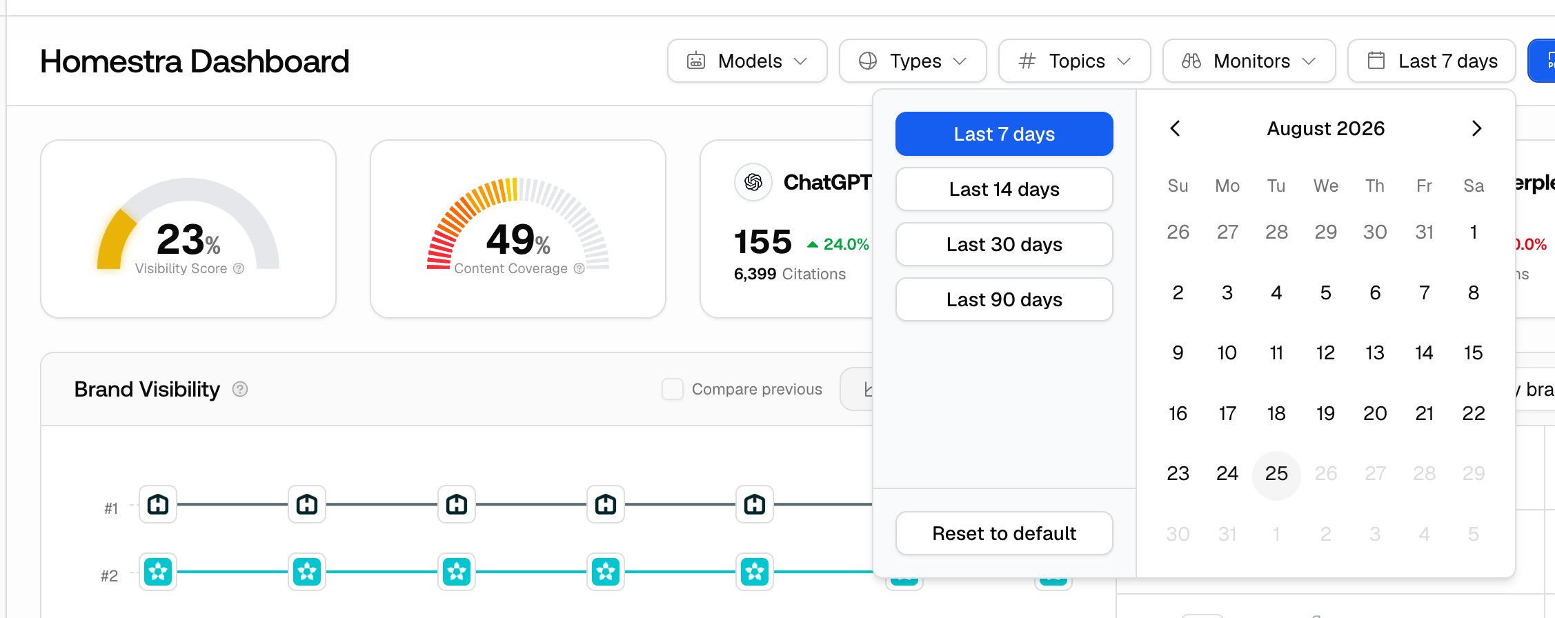
Every analytics page has a date range picker with presets: Last 7 days, Last 14 days, Last 30 days, and Last 90 days (a few pages add Last 24 hours), plus a custom range. "Last 7 days" includes today plus the six prior days, so a daily chart shows seven bars.
The default range adapts to your plan's tracking cadence and, on monitor pages, to how old the monitor is. Project-wide pages default to Last 7 days on daily plans and Last 14 days on weekly or every-other-day plans. Monitor pages take the wider of a frequency floor (daily: 7 days, weekly: 30 days, monthly: 90 days) and an age bucket, so a daily monitor older than 30 days defaults to Last 90 days. The practical rule stands regardless: your window should contain at least four or five scheduled runs. If your monitor runs weekly, a 7-day window shows one data point and any "trend" you see in it is imaginary.
Your selected range sticks per page as you navigate, and it lives in the URL, so a link you share shows the colleague exactly the view you saw.
 ### Filters: isolate before you conclude
The dashboard filter bar is models, prompt types, topics, monitors, and the date range; most other analytics pages share models, prompt types, topics, and the date range, with tag and intent filters on the pages where they apply (the monitor filter itself is only on the dashboard and the Prompts section). Filters exist because blended averages hide causes. A 5-point overall drop could be one model changing behavior, one topic losing ground, or one monitor's market shifting, and each has a different fix.
The single most useful cut is per model. Isolate each model in turn and you'll often find the "drop" lives entirely on one platform while the others are flat, which turns a vague alarm into a specific question.
### Compare previous: give numbers a baseline
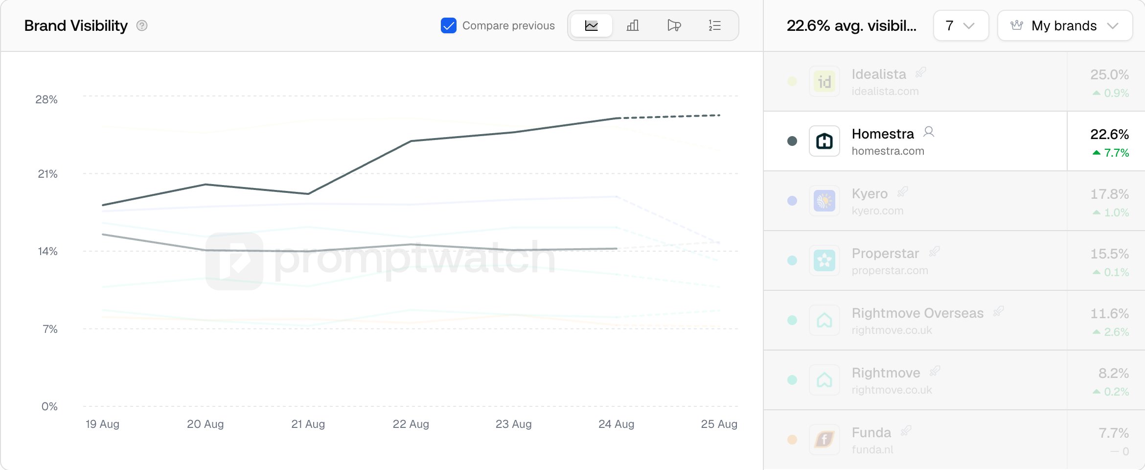
The Brand Visibility chart has a "Compare previous" checkbox. On the Line and Bar views it overlays the preceding period of the same length; the Share of Voice and Rank tabs don't overlay a previous series, but the brand list beside the chart shows the previous-period change on every view. Use it whenever you're about to report a number, because a score only means something against its baseline: "42 this month" is noise, "42, up from 36" is progress. The visitor cards on the dashboard show the same previous-period change automatically.
### Filters: isolate before you conclude
The dashboard filter bar is models, prompt types, topics, monitors, and the date range; most other analytics pages share models, prompt types, topics, and the date range, with tag and intent filters on the pages where they apply (the monitor filter itself is only on the dashboard and the Prompts section). Filters exist because blended averages hide causes. A 5-point overall drop could be one model changing behavior, one topic losing ground, or one monitor's market shifting, and each has a different fix.
The single most useful cut is per model. Isolate each model in turn and you'll often find the "drop" lives entirely on one platform while the others are flat, which turns a vague alarm into a specific question.
### Compare previous: give numbers a baseline
The Brand Visibility chart has a "Compare previous" checkbox. On the Line and Bar views it overlays the preceding period of the same length; the Share of Voice and Rank tabs don't overlay a previous series, but the brand list beside the chart shows the previous-period change on every view. Use it whenever you're about to report a number, because a score only means something against its baseline: "42 this month" is noise, "42, up from 36" is progress. The visitor cards on the dashboard show the same previous-period change automatically.
 ### When is a movement real?
Run a suspected change through this checklist before acting on it:
* **Is it sustained?** One or two days of movement in a daily-tracked project is normal variance. Three or more consecutive scheduled runs in the same direction is a trend.
* **Is the sample big enough?** A monitor with 5 prompts on 2 models produces 10 responses per run, and a single changed answer swings the average by 10%. Small setups need longer windows before any conclusion.
* **Is it one model or all of them?** Filter per model. All models moving together suggests something about your brand or content changed. One model moving alone usually means that platform changed its behavior or sources; see [No data for a model](/docs/academy/no-data-for-model) when a model stops reporting entirely.
* **Did the denominator change?** Adding prompts or activating a monitor changes what the Visibility Score averages over. Adding a competitor doesn't change your Visibility Score, but it changes Share of Voice, because that metric adds their mentions to the denominator. Check whether your setup changed on the day the line bent.
* **Is it prominence or coverage?** Compare the Visibility Score view with the [Share of Voice](/docs/academy/share-of-voice) view. Score down with share flat means you appear as often but less prominently. Both down means you're losing answers outright.
For the full diagnostic when your score falls, see [Why did my score drop?](/docs/academy/why-did-my-score-drop) and [Data freshness](/docs/academy/data-freshness) for when the explanation is simply that today's runs haven't finished.
### After you've confirmed a real change
Narrow the filters until you can name the segment that moved, then open the [responses](/docs/academy/understanding-responses) for that segment and read what the model is actually saying now. The chart tells you that something changed; the responses tell you what to do about it.
### When is a movement real?
Run a suspected change through this checklist before acting on it:
* **Is it sustained?** One or two days of movement in a daily-tracked project is normal variance. Three or more consecutive scheduled runs in the same direction is a trend.
* **Is the sample big enough?** A monitor with 5 prompts on 2 models produces 10 responses per run, and a single changed answer swings the average by 10%. Small setups need longer windows before any conclusion.
* **Is it one model or all of them?** Filter per model. All models moving together suggests something about your brand or content changed. One model moving alone usually means that platform changed its behavior or sources; see [No data for a model](/docs/academy/no-data-for-model) when a model stops reporting entirely.
* **Did the denominator change?** Adding prompts or activating a monitor changes what the Visibility Score averages over. Adding a competitor doesn't change your Visibility Score, but it changes Share of Voice, because that metric adds their mentions to the denominator. Check whether your setup changed on the day the line bent.
* **Is it prominence or coverage?** Compare the Visibility Score view with the [Share of Voice](/docs/academy/share-of-voice) view. Score down with share flat means you appear as often but less prominently. Both down means you're losing answers outright.
For the full diagnostic when your score falls, see [Why did my score drop?](/docs/academy/why-did-my-score-drop) and [Data freshness](/docs/academy/data-freshness) for when the explanation is simply that today's runs haven't finished.
### After you've confirmed a real change
Narrow the filters until you can name the segment that moved, then open the [responses](/docs/academy/understanding-responses) for that segment and read what the model is actually saying now. The chart tells you that something changed; the responses tell you what to do about it.