

Set the list first
Every competitor comparison starts from the list under the Brand rail tile, then Competitors. All brands found in your responses land here, in three tabs: Direct Competitors, Ignored and Suggestions. Each row has a Relation dropdown (Direct competitors, Ignored, No relation), the Suggestions tab has Ignore selected, and Add Competitor adds one that hasn’t shown up yet. The list matters because of the My brands scope you will see on most charts: it is your brand plus your direct competitors, and nothing else. Share of Voice is a share of the brands the chart shows from that scope, so a padded list dilutes your number without telling you anything. Keep Direct Competitors to the two or three brands whose content overlaps most with your monitored prompts, and mark the noise as Ignored. The full flow is in identifying your competitors.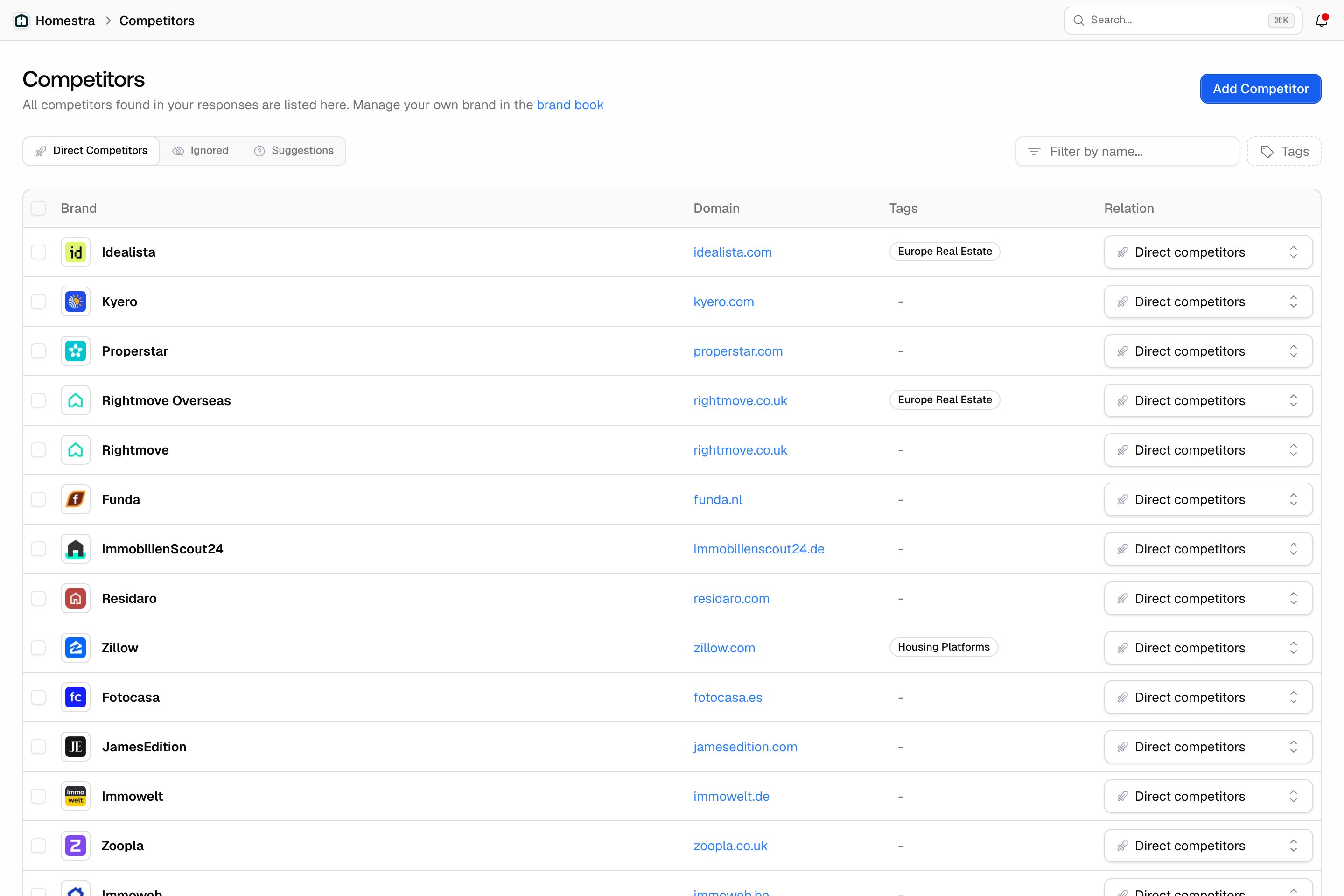
Who is ahead: Share of Voice
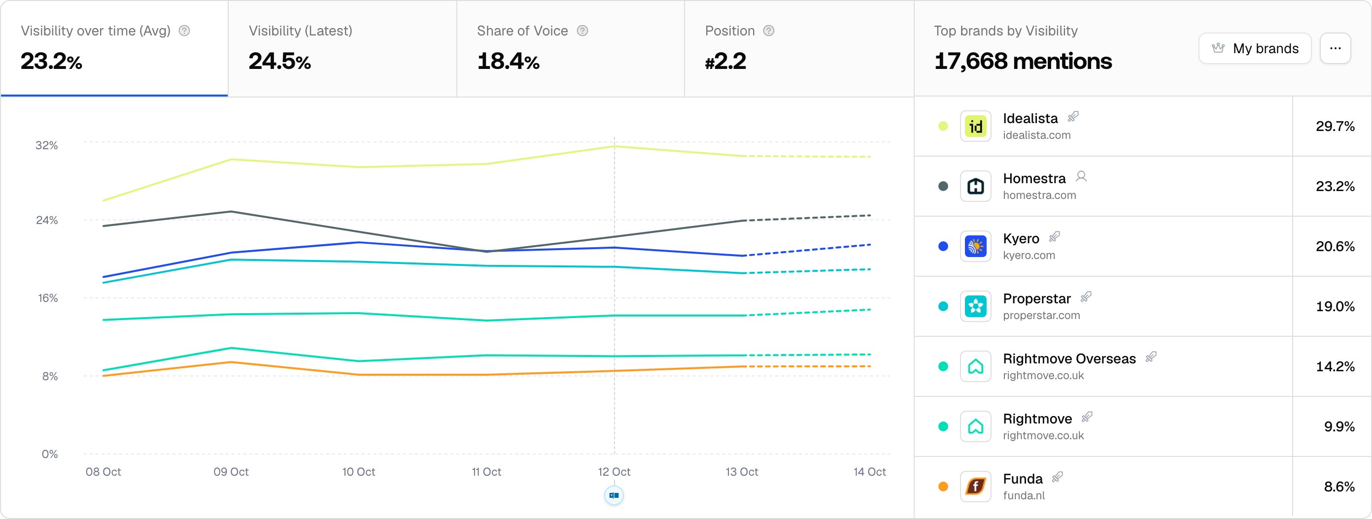
The brand visibility chart on your dashboard (the Brand visibility over time widget under Home) draws one line per brand. Its four tabs are Visibility over time (Avg), Visibility (Latest), Share of Voice and Position, and the Top brands by … list on the right ranks the brands for whichever tab is active. Click a brand in that list to highlight its line. Start on Share of Voice. It is the competitor-relative metric: your slice of all brand mentions, presence only, so it answers “who gets named more” before anything about how well. A low Share of Voice with a healthy Visibility Score means a coverage problem, not a quality problem. See Share of Voice. Three controls change what you are comparing:- Brand scope: My brands (you plus direct competitors) or All brands (every brand detected). The dashboard defaults to My brands; the same chart on a monitor’s Overview tab defaults to All brands, which is why the two can disagree for the same period.
- Compare previous, in the ”…” menu: adds a delta to each tab card against the previous period. Data is daily, so this is how you read who gained share period over period.
- Number of brands, in the same menu: the chart shows the top 7 brands by default, including yours, and can go up to 28 (the Position tab always shows 7).
How well each brand is placed: Visibility and Position
Share of Voice counts appearances; the next two tabs grade them. Visibility over time (Avg) compares each brand’s Visibility Score, which weighs placement, share of attention and depth in each answer and counts absent answers as zero. Visibility (Latest) shows the same score for the most recent day. Position compares the average rank of each brand’s first mention in an answer, counted from 1, so “#1.4” against a competitor’s “#2.8” means models usually name you first. See Position in answer. Read the two together with Share of Voice: a competitor who is named less often but ranks first when named is a different threat from one who is everywhere but late in the list.Which model and which topic: the Heatmap
The chart blends every model and topic. The Heatmap splits them. It is a widget in the default dashboard layout, and it is the Heatmap tab on each monitor (rail tile Prompts, then Monitors, open a monitor). Pick a metric (Visibility, Sentiment, Position, Share of Voice or Win Rate), and pick any two of brands, models, topics and countries as the axes. When brands are an axis, or the metric is Share of Voice, the same All brands / My brands scope filter appears. A dash is a brand that does not appear in that cell at all. Win Rate is the head-to-head number: the share of answers in which a brand ranks first. Brands by models with Win Rate tells you in one grid which platform each competitor owns. See Heatmap.Which prompts: By Position, By Competitor and Trends
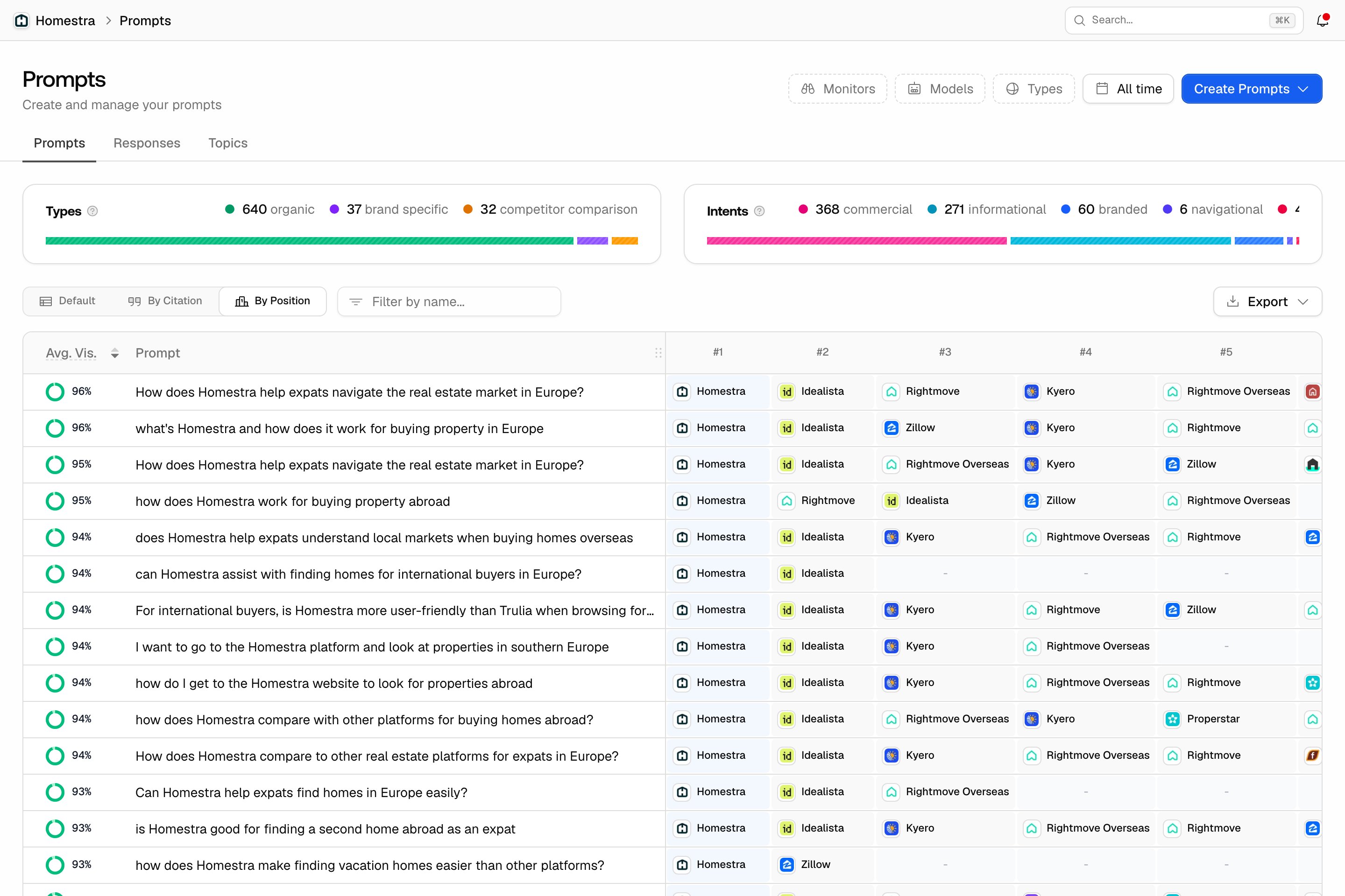
Once you know the model and topic, go to prompt level under the Prompts rail tile:- Prompts page, By Position view: a row per prompt with your brand and your direct competitors ranked by visibility over a fixed last-30-days window, with an Avg. Vis. column. This is where “which prompts mention competitors but not you” gets a concrete answer. It exports as Prompts by rank or Brands by prompt.
- Prompts page, Topics tab, By Competitor view: a topic-by-brand grid, for the same question one level up.
- Trends: how prompt visibility moves over time, with the biggest movers, so you catch a competitor taking a prompt before the blended chart shows it.
- Open any prompt and its page carries its own brand visibility chart, scoped to that prompt.
How they are framed: Sentiment by competitor
Rail tile Prompts, then Sentiment, then the By Competitor tab, compares how answers describe each brand. A competitor filter is available on this tab. A rival with a higher Share of Voice but weaker sentiment is being recommended with caveats, which is an opening. See sentiment tracking.Why they win: their sources
Competitors show up in AI answers because something cites them, and you can see what:- Citations: rail tile Sources, then Citations, with the Competitors filter to see which domains and URLs back their mentions. See understanding sources.
- Offsite Mentions: third-party pages that mention your brand and your competitors across the web. See Offsite Mentions.
- Page Tracker: watch a competitor’s URL to see when and where it gets cited. See Page Tracker.
Closing the gap
Once you know where you stand, the work is the same three moves as before, now with the data to aim them:- Strengthen pages already cited: build depth and recency into the content AI engines already trust, with Content Refresh.
- Target competitor-heavy prompts: take the prompts from the By Position view where a direct competitor ranks and you don’t, and publish content that answers them directly with Content Creation.
- Expand into untapped prompts: use Content Gap to find tracked prompts your site doesn’t cover yet, then publish content for them.