

What sentiment tracking answers
Visibility tells you how often AI models mention your brand; sentiment tells you what they say when they do. Responses with a determinable stance toward your brand get a score on a 100-point scale; thin name-only mentions are left unscored. How scoring works is covered in what is a sentiment score; this article is about the workflow: reading the trend, spotting a problem, and finding the exact responses behind it. That last step is the point of the page. An average score of 62 is not actionable. The three responses that call your product “overpriced with slow support” are. You’ll find the page in the sidebar under Monitoring → Sentiment.Reading the trend
The top of the page shows your daily average sentiment score over the selected date range. Next to it, a summary card shows the current score out of 100, the change versus the previous period, a score-position bar, and a breakdown by prompt type (Organic, Competitor Comparison, Brand Specific).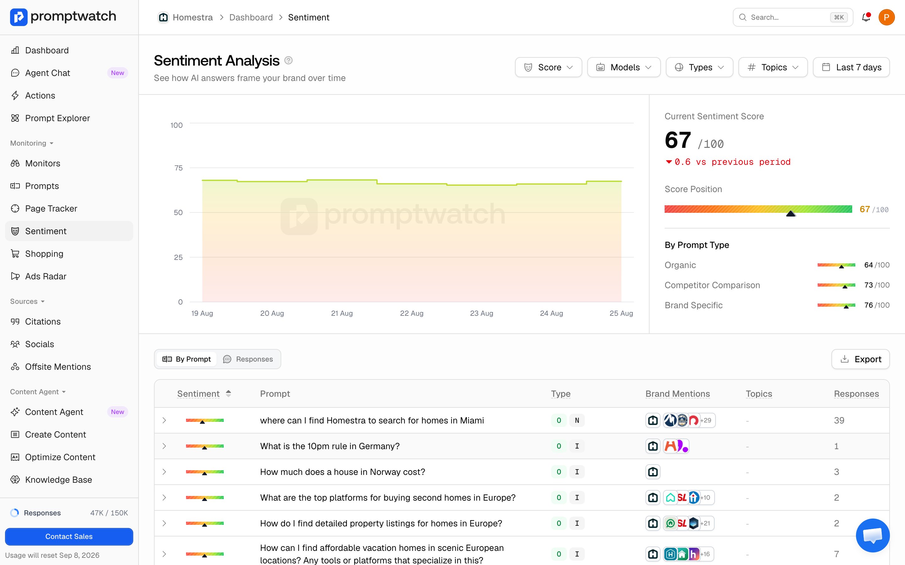
- Judge the level once, the movement always: a stable 55 is a fact about your brand; a drop from 70 to 55 in two weeks is an event with a cause. Investigate movement, not levels.
- Check the volume behind the line: on days with few brand mentions, one harsh response swings the daily average. A one-day dip is noise; a multi-day slide is signal.
Slicing the data
The filter bar narrows the page. Models, types, topics, and date range apply to the chart and both tables; score ranges apply only to the tables, not the trend chart:- Sentiment score ranges:
< 30,30 - 50,50 - 75, and75 - 100. Selecting< 30is the fastest route to problem responses. - Models: sentiment often diverges per platform, because each model reads different sources. A score that’s fine on ChatGPT and poor on Perplexity points at the review sites and forums Perplexity favors.
- Prompt types and topics: comparison prompts usually score lower than informational ones, since answers weigh you against competitors. Filtering by topic shows which themes carry the negativity.
- Date range: scope the analysis to a release, a campaign, or a PR incident.
Finding the responses dragging you down
Below the chart, four tabs hold the drill-down and the competitor context:- Open the By Prompt tab, already sorted lowest score first. Each row shows a prompt with its average score as a bar, its type, brand mentions, topics, and response count, so you see which questions consistently produce negative answers. Expand a row to see its responses.
- Switch to the Responses tab for individual responses, each with its own score, model, and date. Apply the
< 30score filter (add30 - 50for the next band).
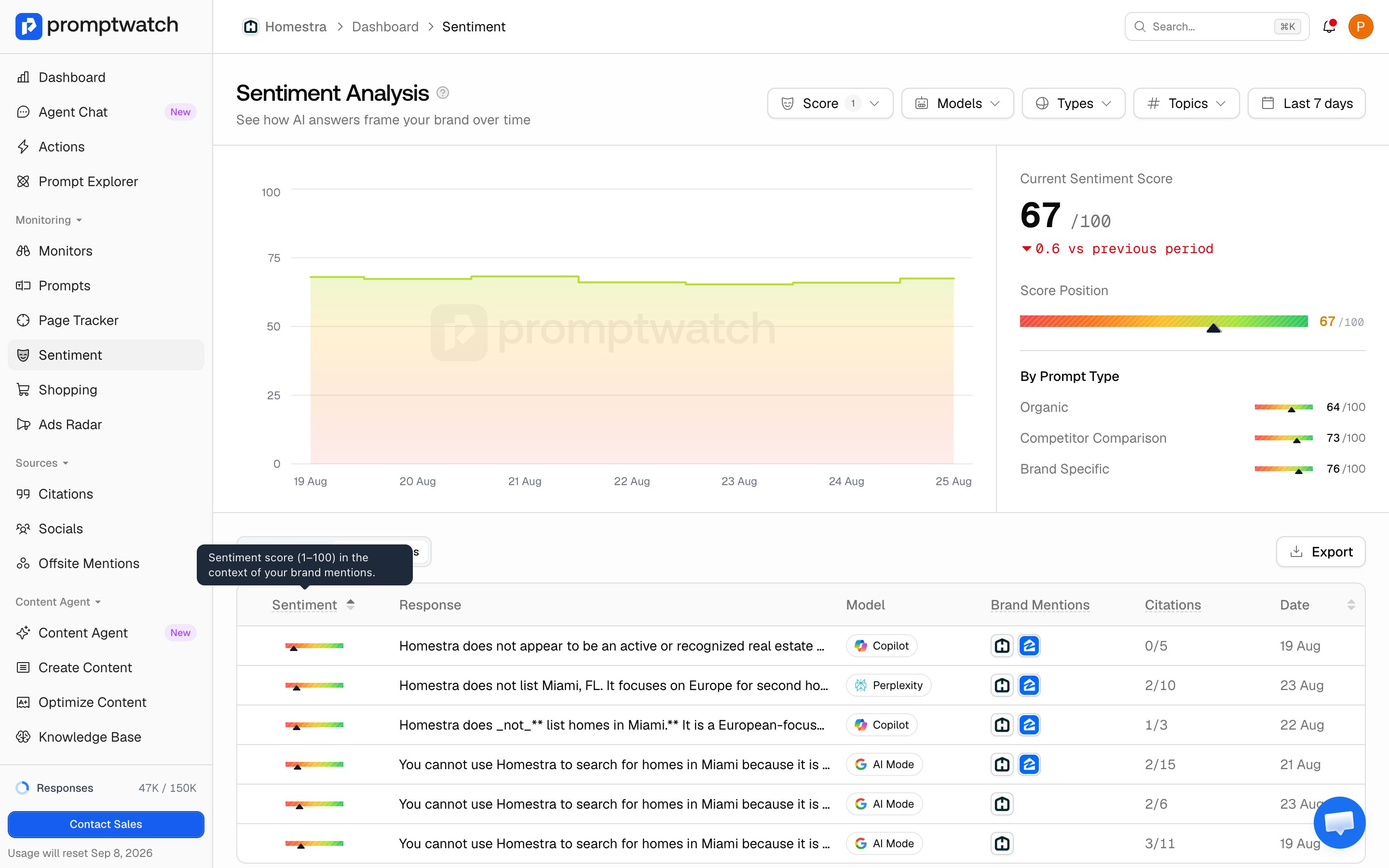
- Click a response to read it in full. The response view shows what the model actually wrote and which sources it cited.