1. Too few prompts
Five prompts on one model produce so few responses that every metric jumps around: one answer that skips your brand visibly moves your average, and you end up reacting to noise. Small prompt sets also measure only slivers of your market, so a great score can just mean you picked the prompts you already win. The fix: start with a prompt set large enough that one missed mention doesn’t swing the average, then grow, mixing organic category questions, brand-specific questions, and competitor comparisons. Your plan caps how many active prompts you can run. Source them from real customer language, support tickets, sales calls, Reddit threads, rather than guessing at the keyboard. See finding the right prompts to track.2. Wrong language or country on the monitor
A monitor runs all its prompts in one country and language, because live-search answers genuinely differ per market. Tracking English prompts against a US context when your customers are in Germany measures a market you don’t sell in, and everything downstream, visibility, competitors, citations, describes the wrong world. The fix: check each monitor’s country and language against where your customers actually are, and split markets into separate monitors (“US - English”, “DE - German”) rather than blending them. Note that the language and country in your Brand Book are only defaults for new monitors; existing monitors keep their own settings and are edited individually. See adding a new monitor and organizing your setup.3. Missing brand aliases
Detection matches your brand name, domain, and aliases against every response. Analysis is model-based with a word-boundary hint, so it can usually tell a company name from a generic word, but it only knows the names you configured. If answers call you “Acme Incorporated”, “ACME”, or your pre-rebrand name and your profile only knows “Acme Corp”, those mentions are often missed and your visibility undercounts. This is one of the most common causes of a mysteriously low score. The fix: open the Brand Book and add every name your brand actually goes by: legal names, abbreviations, former names, domain-style spellings. Keep category keywords and taglines out, they’d credit you with mentions you didn’t earn. For competitors, keep each one’s canonical name and website accurate so their mentions are detected correctly. See your brand profile.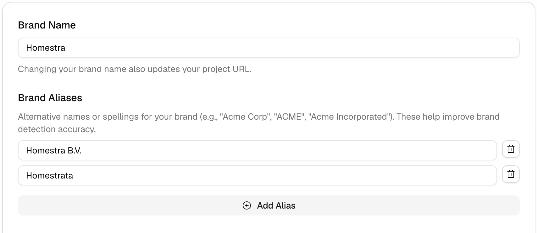
4. A competitor list that’s empty or too broad
Competitors are set at the project level and define the denominator of Share of Voice. An empty list means no comparison at all, you’ll see your own numbers with no sense of who’s beating you. A bloated list is subtler: adding every brand that ever appears in an answer, including ones you don’t actually compete with, dilutes your share and makes the metric describe a market you’re not in. The fix: track the brands a customer would genuinely shortlist against you, and prune the rest. Revisit the list quarterly, since AI answers surface competitors you may not have considered. See identifying your competitors.5. Skipping topics and tags
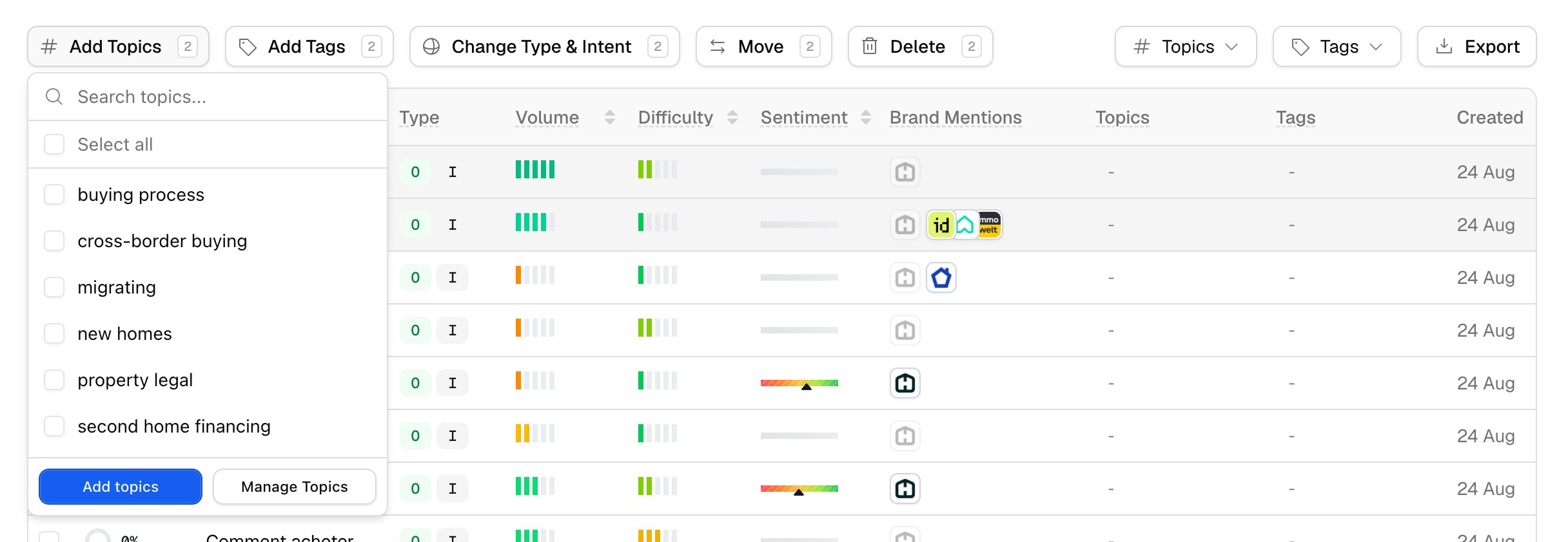
With no structure on your prompts, every question becomes a scroll through the full list. Which topics are weak, how pricing prompts compare to integration prompts, what the Q3 campaign changed, all of it is one filter away if you labeled your prompts, and a spreadsheet session if you didn’t. Retrofitting labels onto hundreds of prompts later is the tedious version of a five-minute habit. The fix: assign topics (what the prompt is about: “pricing”, “alternatives”, “integrations”) and tags (your own groupings: campaigns, funnel stage, owner) as you add prompts. Topics filter charts and tables across monitors, including the project dashboard. Tags do the same on monitor views, the Prompts table, citations, content gap, and most exports; the project dashboard slices by monitor and topic, not by tag. See organizing your setup.