

What the heatmap shows
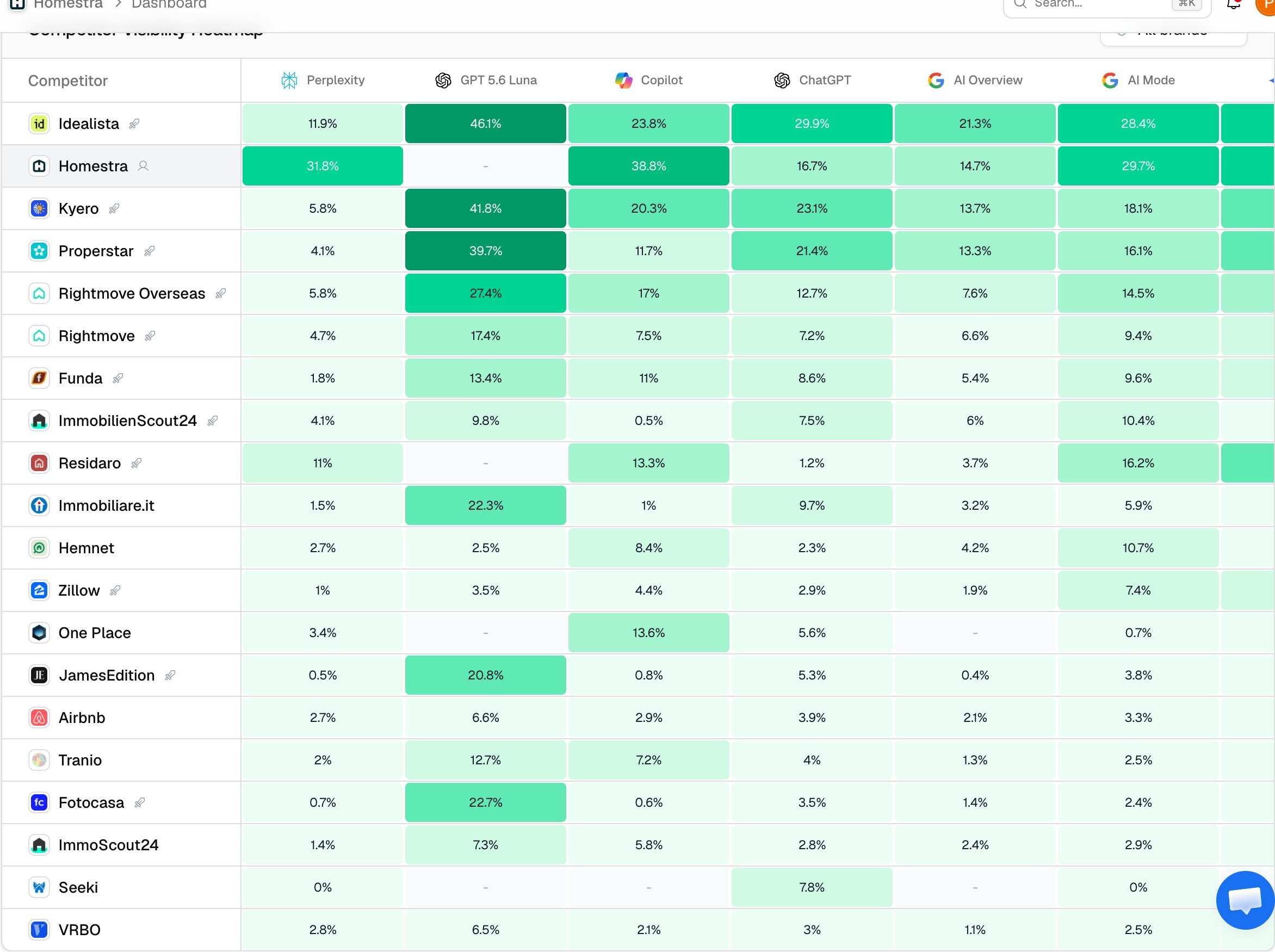
The Competitor Visibility Heatmap is a matrix: one row per brand, one column per AI model, and each cell holds that brand’s average visibility score on that model for the selected period. It exists because blended averages hide model-level problems. It is common to lead on ChatGPT and be nearly invisible on Perplexity while your overall score looks respectable, and the heatmap is the one view where that pattern is impossible to miss. You’ll find it at the bottom of the project dashboard, and as a dedicated Heatmap tab on each monitor. The page-level filters (models, prompt types, topics, monitors, date range) apply to it like every other widget.What a cell means
Each cell is a 0-100 visibility average: the brand’s visibility score in each of that model’s responses (zero when the brand is absent) is averaged per day, and the daily averages are then averaged across the period. The per-day step means one unusually heavy day can’t dominate a quiet week, and counting absences as zero means the cell reflects coverage as well as prominence, exactly like the main Visibility Score. Two display details matter for reading it correctly:- Colors are relative to the current view, not to a fixed scale. The deepest green is the strongest cell on screen right now, so colors compare brands within this view and are not comparable across different filter sets or periods.
- A dash means absent: the brand never appeared in any analyzed response on that model in the period. That is a different signal from a low number, which means the brand appears but weakly.
Who appears in the rows
By default the heatmap shows all detected brands, which includes brands you haven’t marked as competitors: useful for discovering who the models actually recommend in your category, which often differs from who you think you compete with. Switch the brand filter to “My brands” to narrow it to your brand plus your listed direct competitors for a cleaner head-to-head. Brands you’ve marked as ignored stay hidden.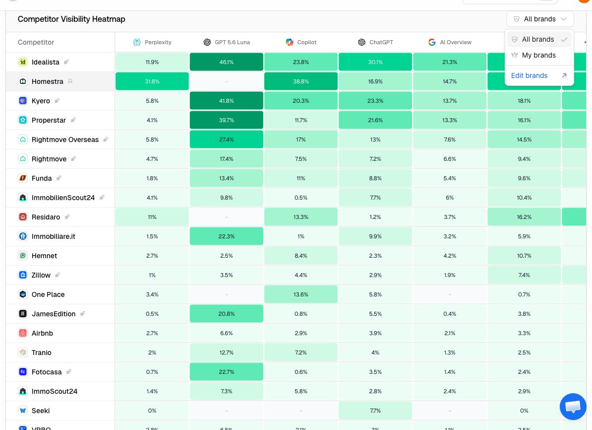
How to read it
- Your row: read it left to right. Uneven cells are the norm; the question is which platforms carry you and which don’t.
- Your weak columns against competitor rows: a model where you score low but a competitor scores high is a winnable gap: the model does recommend brands like yours there, just not you.
- Empty columns: a dash for you on a model where competitors have numbers means you’re not part of that platform’s answer set at all, which usually points at sources that platform trusts and you’re absent from.